
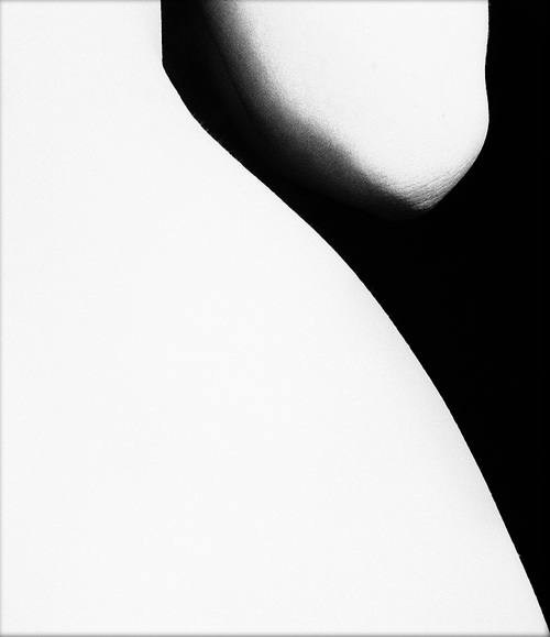
 | I love the nude work of Bill Brandt. He looked beyond just the human body and saw gorgeous abstract shapes that he captured beautifully with his high-contrast black and white signature style. I love the composition of this particular image, the diagonals making the photo move, you feel like the body should be dancing or is in the middle of turning. I also like that there isn't much negative space, the negative space being the black in this image. Brandt has filled the space with the model's arm - otherwise the photo would feel empty and the overall image wouldn't have any context. |
| Lee Jeffries uses contrast in a much different way - rather than using it to pick out shapes he creates detail. I love this use, making small dimples and marks in skin really stand out. I'd like to implement this kind of use in my own work - maybe using a macro lens to get small details and using editing software to increase the contrast picking out those small details further. | 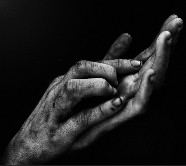 |
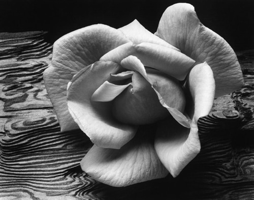 | Ansel Adams' work is another example of high contrast for detail. I love this photo of a rose on driftwood, you can see every individual fold and ripple along the petals of the rose. I hope for my own work to be this detailed. The composition of this particular image could be better - Adams has used the rule of thirds but the rose feels like it takes up too much space in the frame and could take up slightly less space to follow the thirds rule better. |
| I like some of the work of Edward Weston as his focus on inanimate objects transforms them into something new. I don't think that this is a technique I'll implement in my current project but it is something I may want to play around with in the future. This lettuce leaf looks like a flowing silk dress or the roots of a giant tree and I love how the lines lead your eyes down and throughout the photo. | 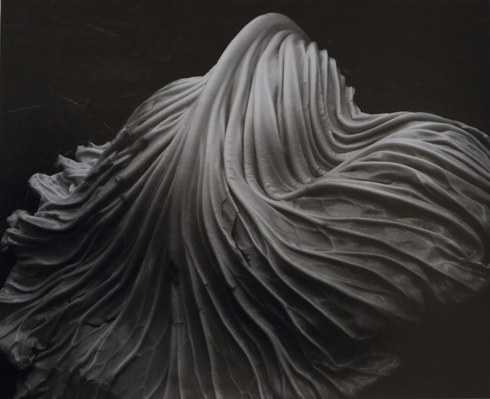 |
 RSS Feed
